Concept
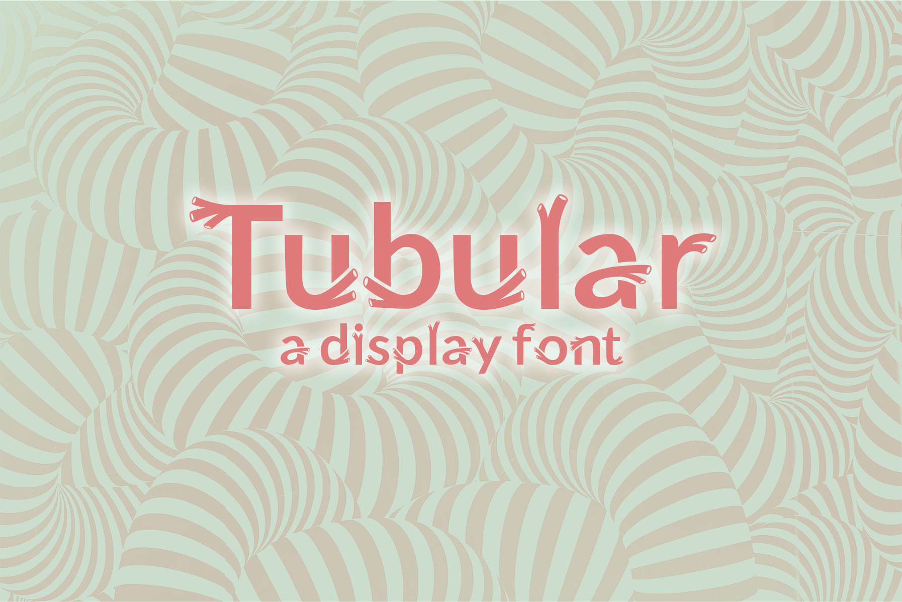
Modifying an existing open source typeface in order to practice letterforms and gain a better understanding of what goes in to creating a typeface.
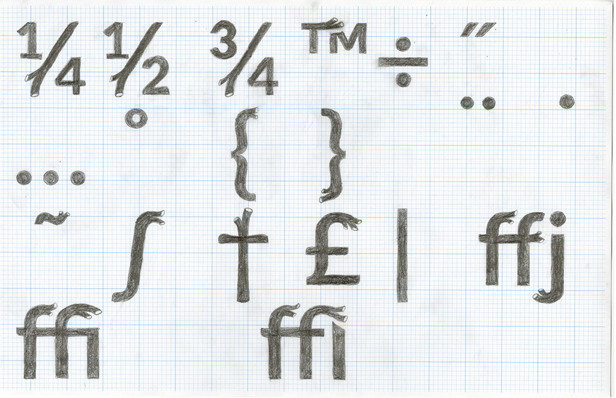
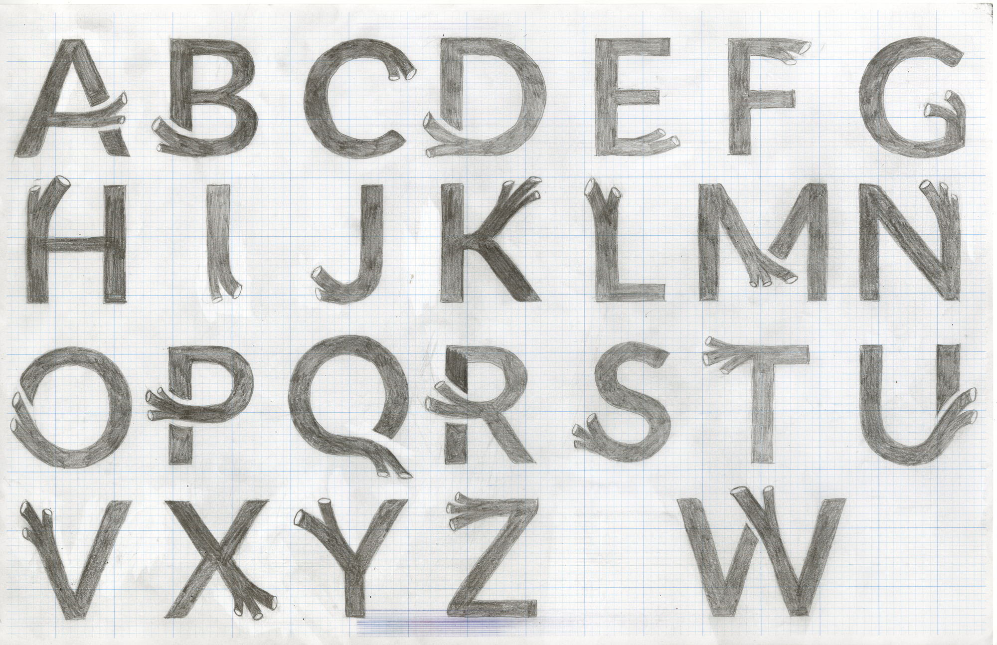
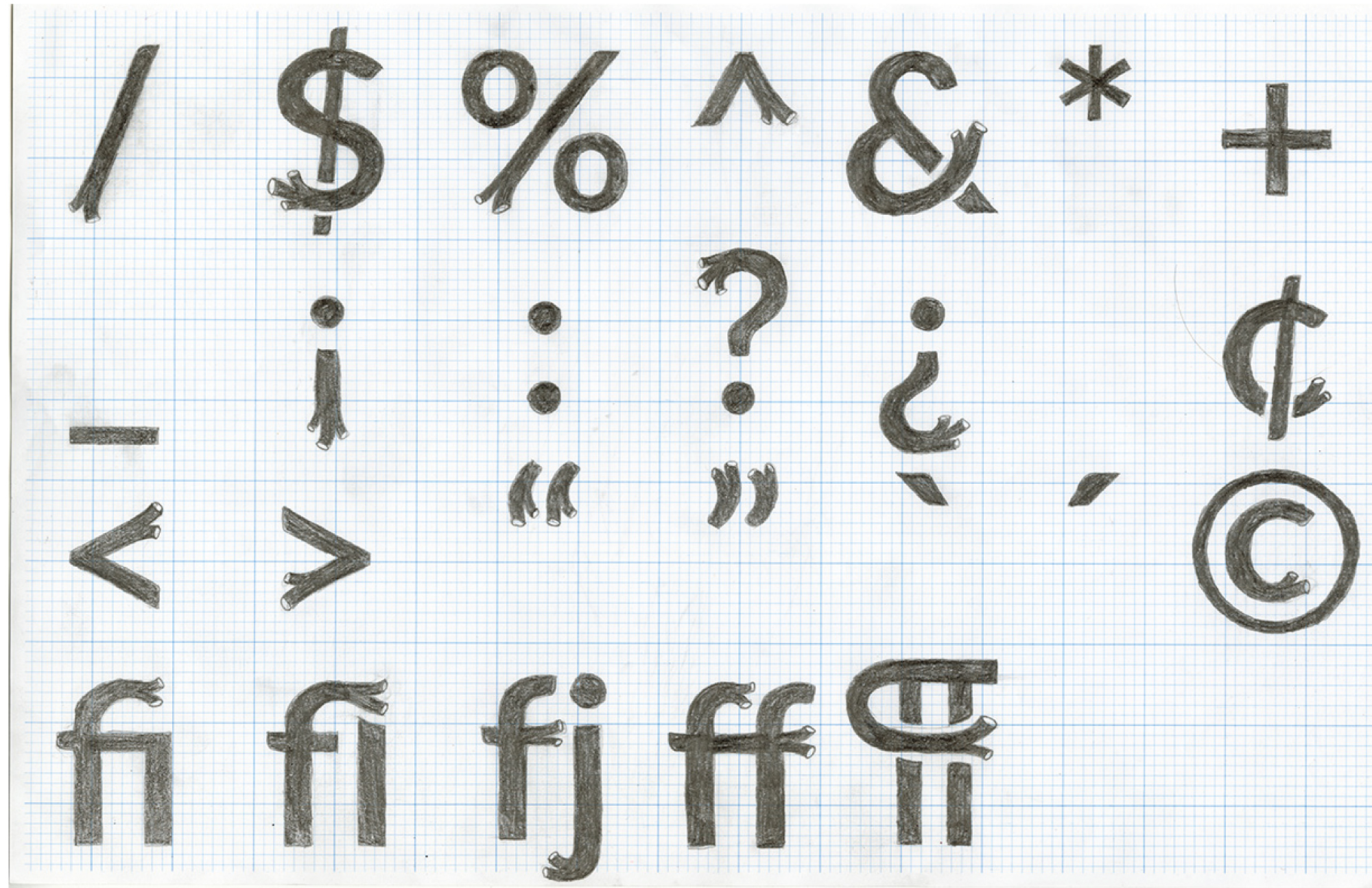
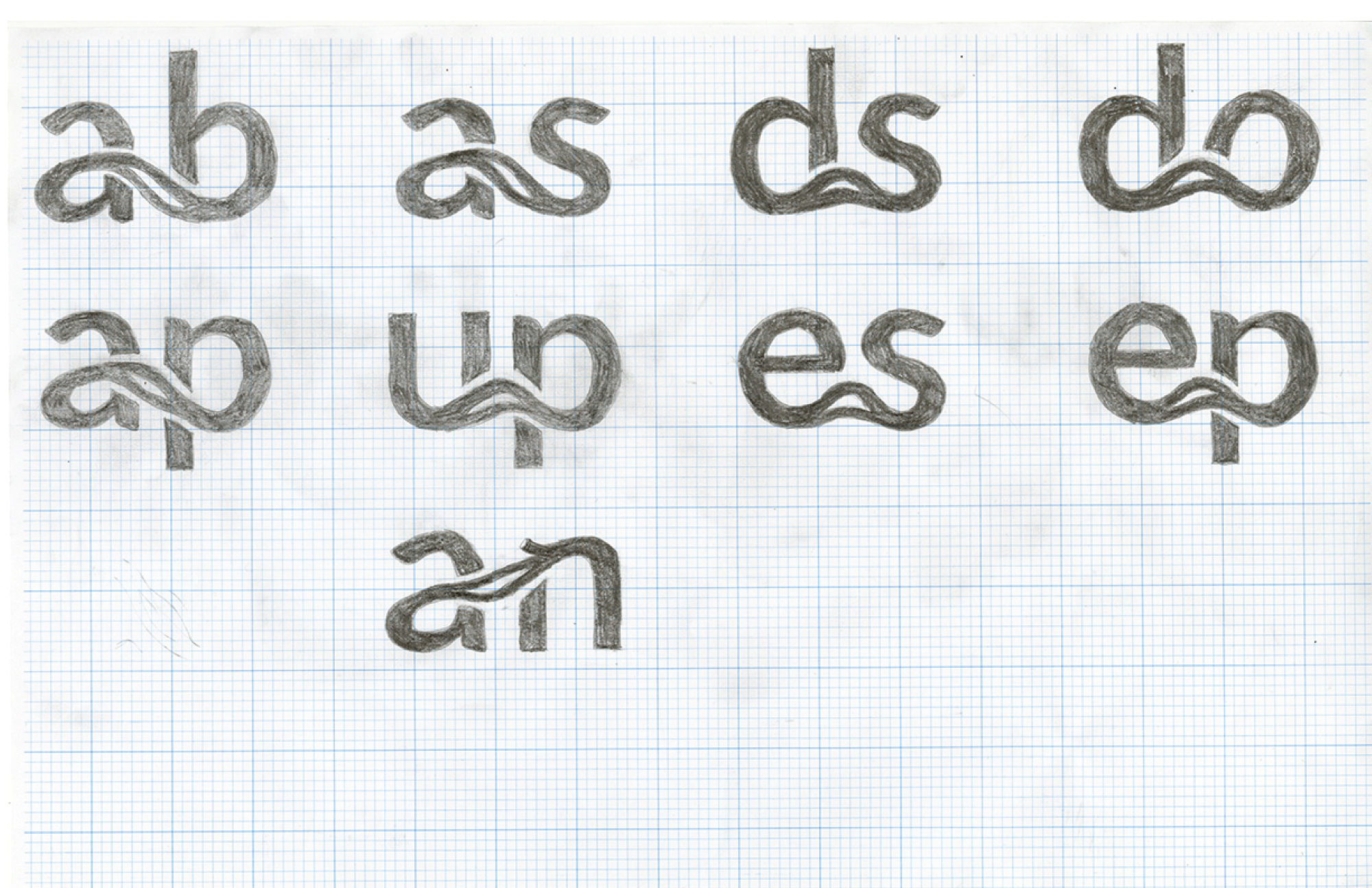
Drawings
Process
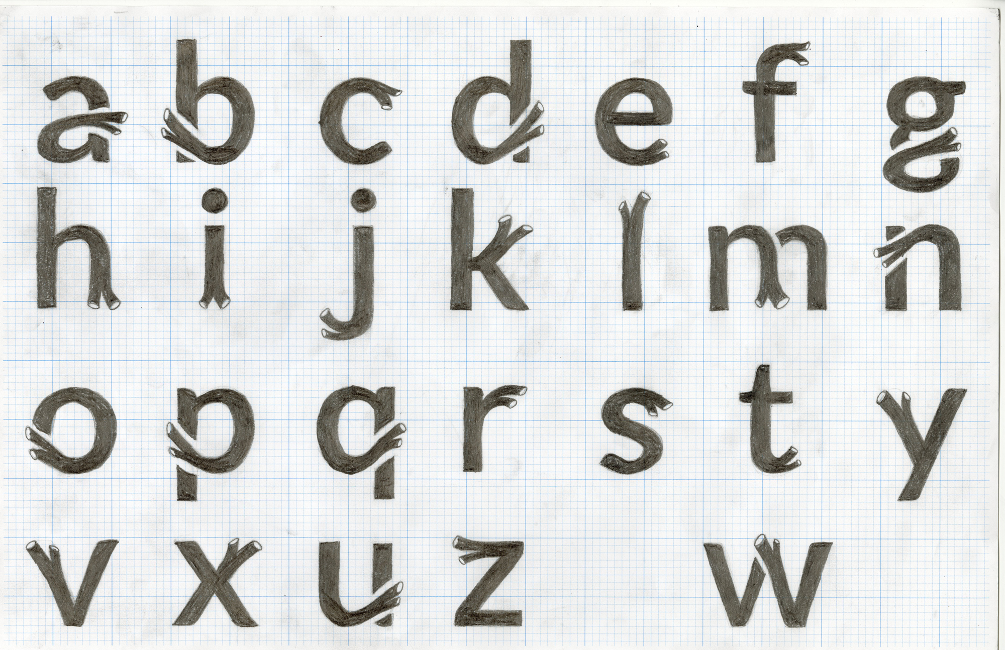
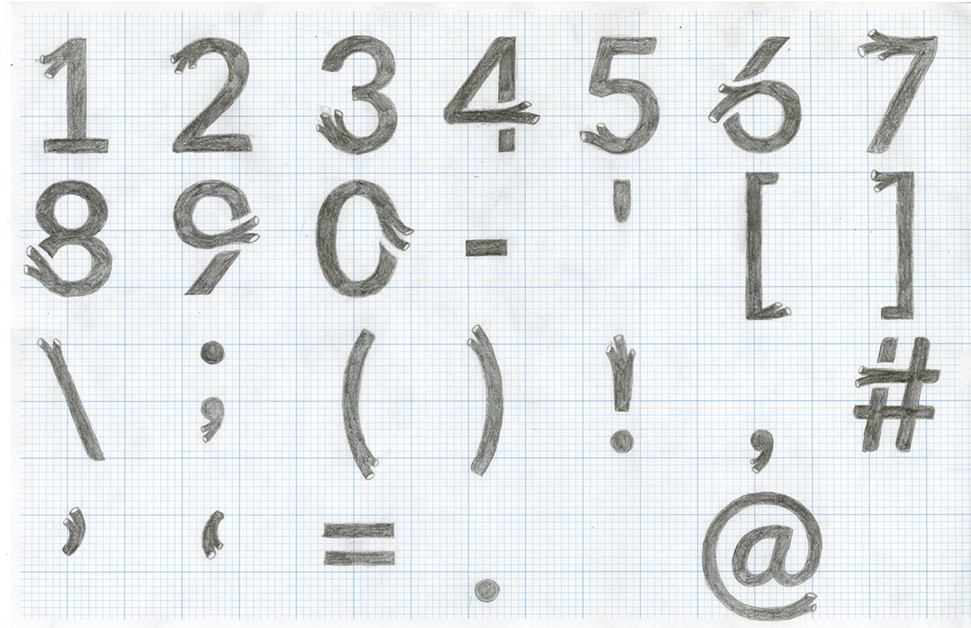
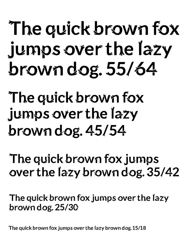
Lato Bold is a bold sans-serif with some very subtle, softer elements. The original concept was a typeface that resembled abstracted hair, which developed into tubes instead. I wanted the tubes to have a lot of variation in size and direction, but for every letter to fit together with the rest cohesively.
I printed all the glyphs of Lato Bold at 200 pt. (2 inch cap-height) on graph paper, and then used that as my guideline for drawing my own tubular letterforms. My process started with following my gut with how I wanted these tubes to branch off, so that they seemed organic. But after my initial sketch, I went back and tweaked letters whose tubes didn’t fit with the rest. After the hand-drawn stage, I scanned the letterforms and used the pen tool to create vector letterforms in Adobe Illustrator. Once that was complete, I moved them into Glyphs and made adjustments.