Create a screen-printed t-shirt design that appeals to the Graphic Design 2 class.
Process
After researching some popular t-shirts on various websites and considering my class’s interests I started the thumbnail process. I came up with 20 concepts and made five thumbnails for each, totaling to 100 thumbnails. After getting feedback from my peers, I continued the design process with the three most popular concepts.
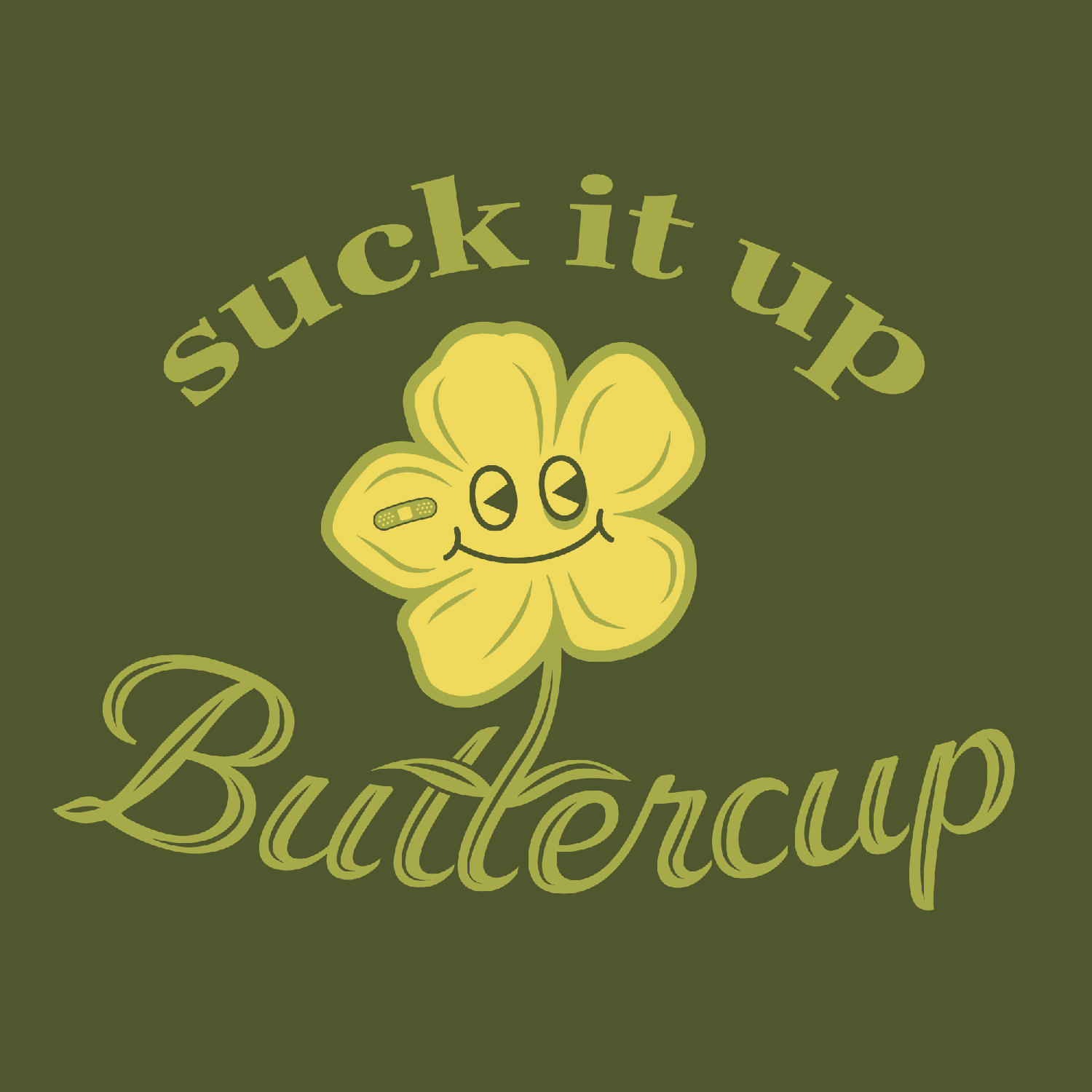
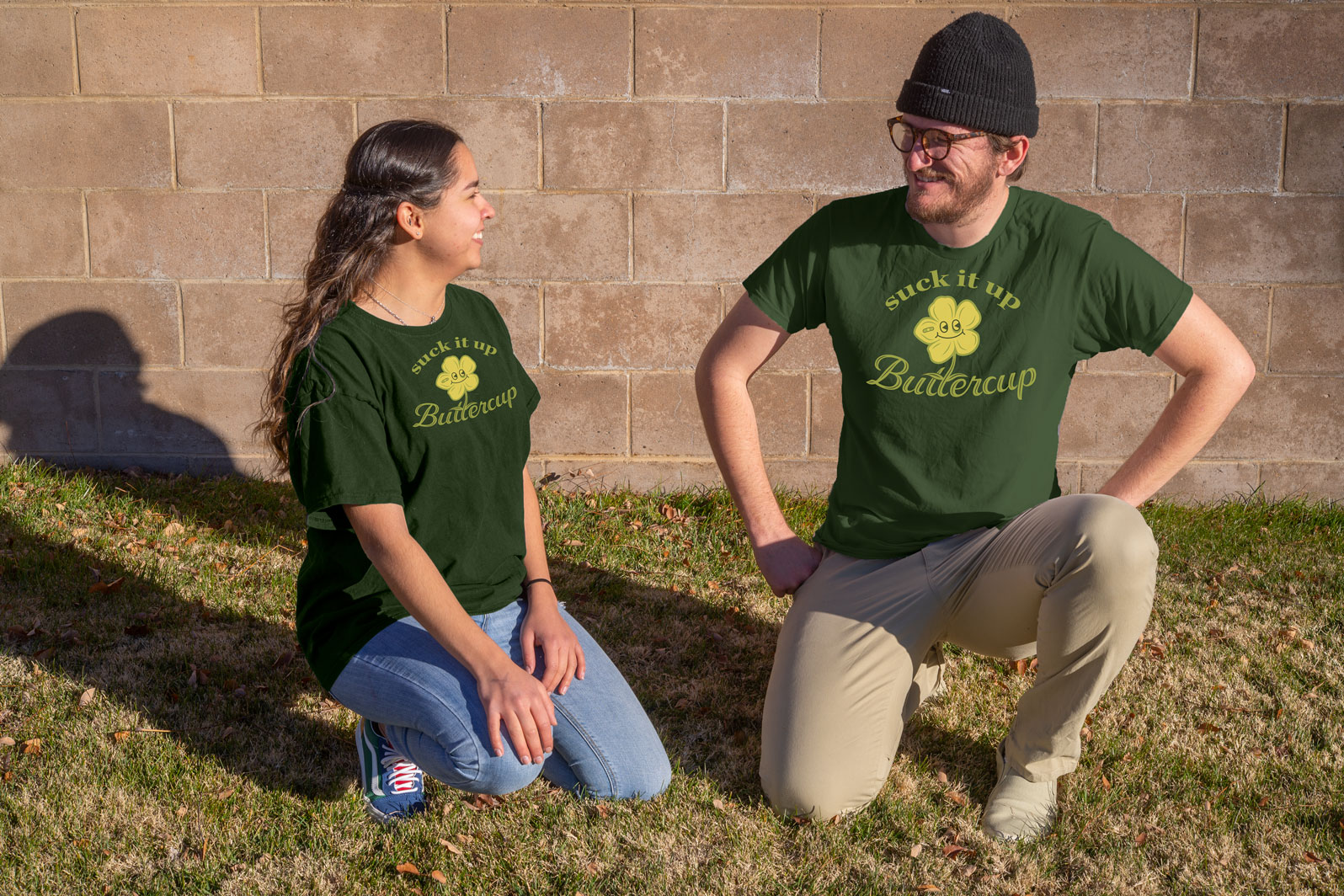
Because design is tough and sometimes you just have to suck it up, I made the suck it up buttercup shirt. I chose a font pairing of a classic-looking serif and a somewhat fancy script that was still readable. These fonts add to the almost sardonic message of the shirt. The illustration was originally just a buttercup flower sarcastically smiling but I thought making it look slightly beat up would add more character and visual interest. For the colors I selected an olive green and yellow pairing to give a vintage feel to match the old-ish saying.
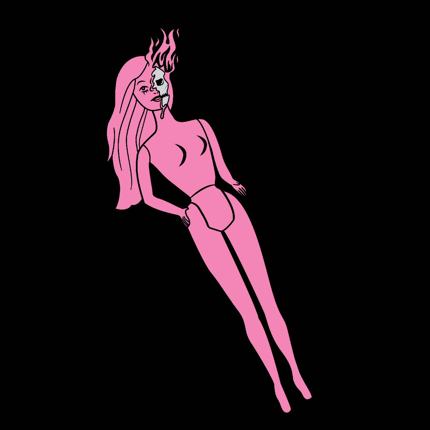
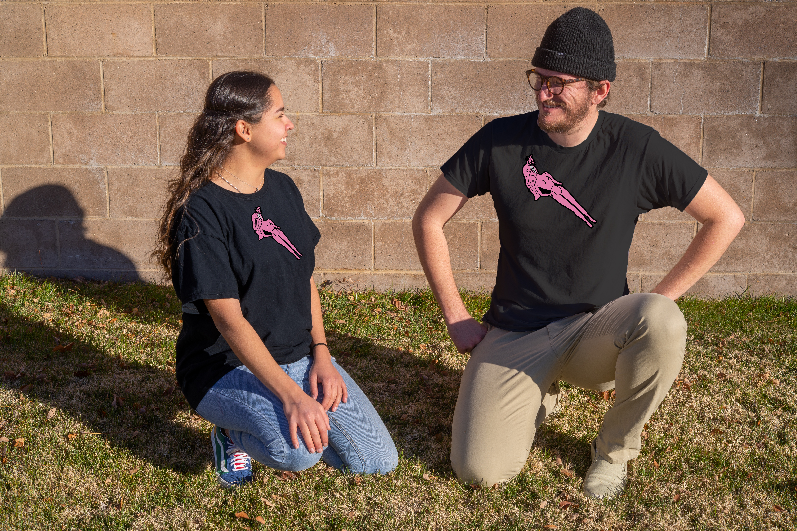
To appeal to the edgy side of my peers, one of my designs depicted a barbie being melted by flames. The original intent of my message was to make a statement about rejecting conformity, gender roles, and beauty standards, but I think the message could be misconstrued as being anti-girliness or femininity. Nonetheless, I wanted to make something that looked badass and incorporated the bright color on dark fabric trend I had seen while researching.
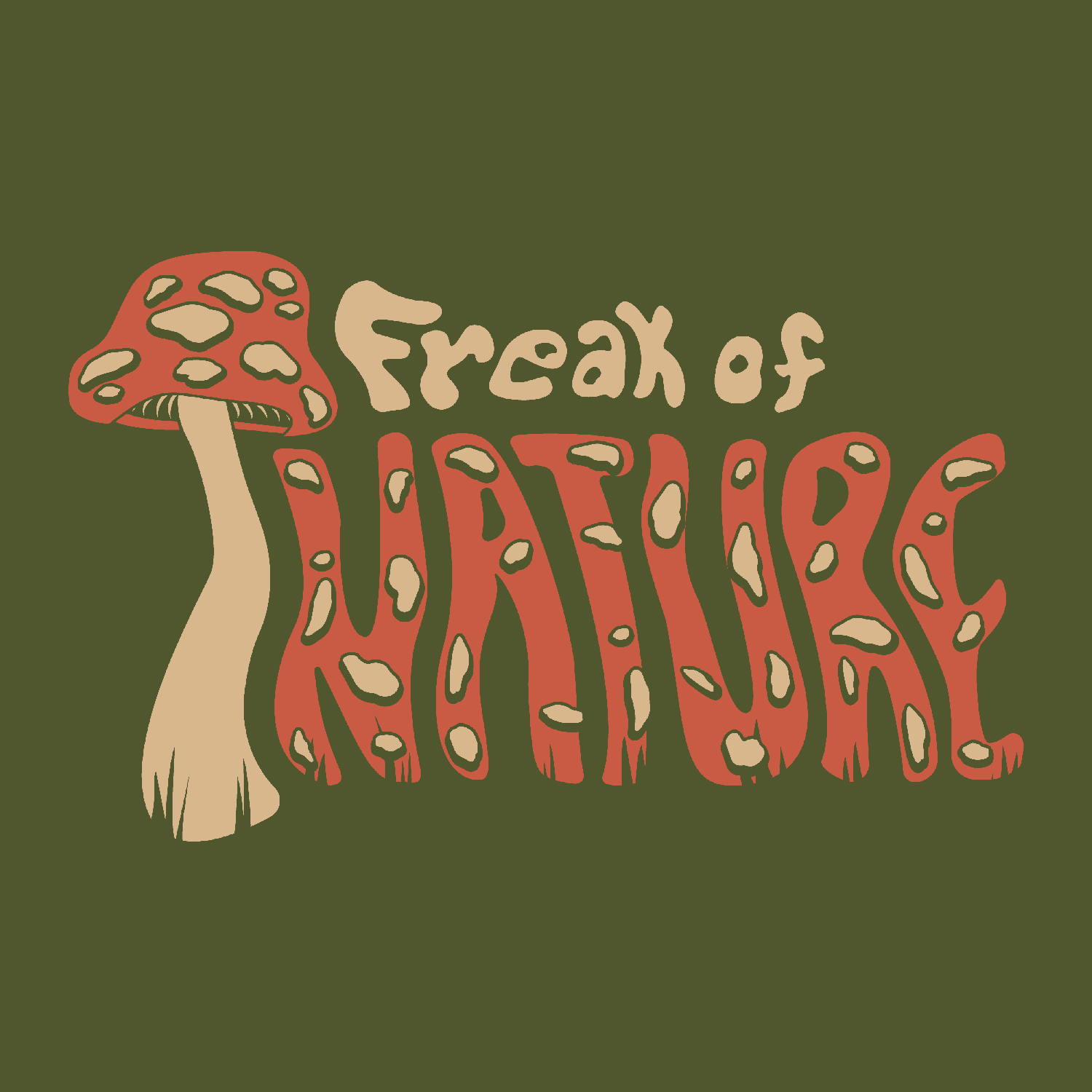
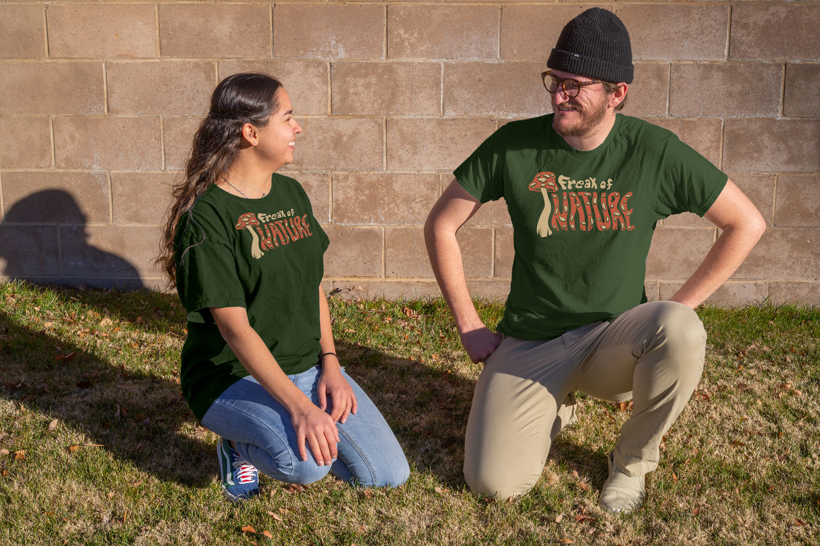
Nature and the outdoors are popular in Colorado and self-deprecating t-shirts were popular in my research. The combination of these two ideas led to “Freak of Nature”. Mushrooms are associated with weirdness and strangeness in nature, so they were a good fit for the subject of the shirt. I wanted the type to look organic and oddly shaped so I drew them out on paper a few times to try to produce letterforms that looked like they had grown around each other. I also used the earthy olive color for the shirt with a contrasting orange-red.